As we discussed in last week’s 5 Minute Friday post, one key aspect to successfully using analytics to drive decision making is being able to tell the story – apply important context to the results to understand what they mean.
Another key consideration is your audience. Your audience should determine what analytics to focus on and how you visualize the results.
Some key questions to consider as you think about how to engage an audience with analytics:
How does your audience normally consume data? Do they prefer charts and graphs or just the bottom-line numbers? Are they open to a different format from what was used before?
What questions does your audience typically ask? Do your dashboards support having quick answers or do you currently have to piece it together?
The HR team engages with a number of different audiences across an organization, each with different needs in terms of information and analytics. Here are 3 examples of how our customers are using different analytic approaches to communicate with Executives and Lines of Business, as well as prepare for those ad-hoc questions that inevitably come up in discussions.
1. Executive Discussion aka “the elevator pitch”
Typically a leadership team is looking at HR results in the context of the current business performance and overall business strategy. The focus is on understanding where investments in your people are working to drive the business strategy.
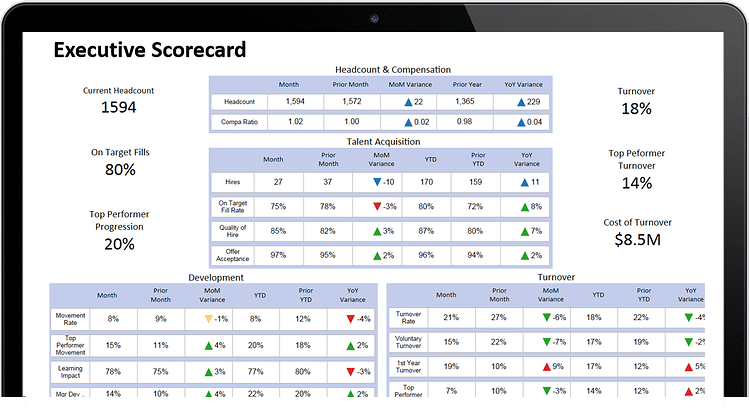
This is where a bottom-line approach using a scorecard like the one below is often more impactful than charts and graphs. A scorecard would only contain a small number of metrics – those you have handy for that elevator ride – to give insight to the workforce impact on key business strategies.
Key questions to address in an Executive discussion:
How are we doing overall? vs. last month? last quarter? last year? a specific target?
Are we achieving the results expected for key workforce priorities?
Consider this example – the company is looking to drive growth by selling into a new market. In order to do that, the workforce needs to grow in that geo by x%. In order to get to full productivity faster in that geo, a new hire talent development program was put in place with more hands-on training than in the past.
Potential analytics for your scorecard: overall headcount, headcount in the geo, sales growth for that geo, sales for new hires that have taking training vs. those that have not, overall turnover and turnover in that geo.
Scorecard metrics should not necessarily be static – there may be some key indicators that you always include and some that will change based on evolving priorities.
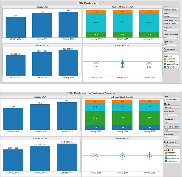
2. Line of Business – How am I doing? How do I compare?
Often an analytics story is told by providing big picture and then drilling into the relevant subset. For the Line of Business (LOB), think about changing the focus – start with just the relevant subset of analytics for that business and then put it in context of the overall company, other parts of the business, or their own targets.
We recommend re-packaging analytics that you may already have to support the discussions you are having with the business. This doesn’t mean creating one-off analytics for each group that can be challenging to manage. It is about establishing a LOB template that is focused on the discussions you normally have with that audience.
Here are two examples using a template where the numbers are specific to different LOBs -Customer Service and IT.
Key questions to consider for your LOB analytics:
How are we doing on key HR priorities for our LOB – headcount, retention, training etc.?
Are we hitting our targets? Is it trending better or worse than prior periods?
How do we compare to other relevant lines of business or company overall?
With a template in place you can then tweak as needed, bringing in additonal analytics that may be unique to certain LOB priorities.
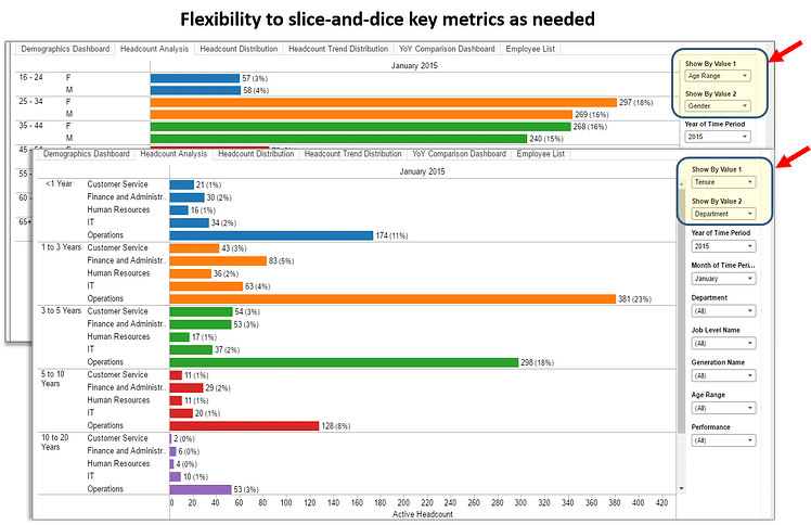
3. Audience unknown – the adhoc Q&A
While there is typically a standard set of analytics needed for Executive or Line of Business discussions, there are always adhoc questions that are raised by various audiences.
It is impossible to pre-plan for these questions and have pre-built dashboards ready to go. Here is where flexible analytic views become important. This means having a standard set of metrics that you can slice-and-dice across the many questions you may receive. We recommend building these views using simple visuals where you can use either the visual or the numbers – once again giving flexibility to address the communication preferences of the audience.
We also suggest that as you hear the same question getting asked over and over, you consider adding those analytics to your standard set of dashboards or scorecards.
Here is an example of simple analytic view where you can slice and dice on different dimensions – in this case in the backdrop view by gender and age, and in the foreground image, filtering by tenure and department.
There is no “one-size-fits-all” dashboard
With the various audiences needing different types of information with different levels of detail, there is no one set of analytic dashboards that will fit all audiences or all discussions. As you use analytics to tell your story, consider how an audience currently consumes analytics, which analytics are most relevant and what context is most important to engage in meaningful discussion.